- 🎨 The fascinating story of Majorelle blue
- 💙 Light Majorelle Blue: tempered boldness
- 🔵 Dark Majorelle Blue: Unapologetic intensity
- 🌍 Symbolism and psychology of Majorelle blue
- 🎨 Winning combinations: taming the intensity of the Majorelle
- 🛠️ Pro tips for a successful application
- 💡 Where to dare to use Majorelle blue in your home?
- ✨ Conclusion: Majorelle blue, a bold choice
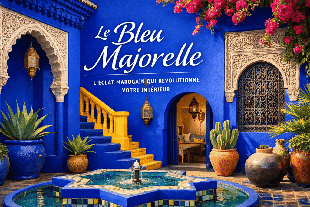
Imagine a color that can instantly transport your living room to the heart of Marrakech’s secret gardens. Neither too flashy nor too demure, Majorelle blue possesses this magical power. Named in homage to the French painter Jacques Majorelle, who made it his signature in his legendary Moroccan garden, this deep, vibrant blue is captivating lovers of bold décor today. Somewhere between cobalt and electric blue, with a hint of green that makes it unique, Majorelle isn’t just a shade—it’s a statement of intent. Discover how to tame this iconic color without veering into kitsch.
🎨 The fascinating story of Majorelle blue
It all began in 1923, when Jacques Majorelle, son of furniture designer Louis Majorelle, settled in Marrakech and acquired a 4-acre plot of land. He fell in love with the zelliges (traditional Moroccan mosaics) and natural pigments used in local crafts, he developed a unique shade which he named “Majorelle blue”. This color, inspired by the blue of Berber djellabas and desert minerals, became the common thread of his villa and gardens.
In 1980, Yves Saint Laurent and Pierre Bergé bought the estate, which was threatened with destruction. The couturier, fascinated by this shade, declared: “Majorelle blue is the most beautiful blue in the world.” Today, the Majorelle Garden welcomes more than 700,000 visitors a year, all mesmerized by this blue that defies time and the Moroccan sun.

💙 Light Majorelle Blue: tempered boldness
Light Majorelle blue (between #5D8AA8 and #6A9AB0) is the ideal starting point for those hesitant about color. By diluting the original shade with white or pearl gray, you get a lighter version, perfect for living spaces where you want to add character without being harsh.
Where to use it? On an accent wall behind a light sofa or fireplace, to paint shelves or a bookcase creating a dynamic backdrop for your books and decorative objects, or in the kitchen on wall units paired with a light wood worktop.
💡 Tip: In a Nordic-style room, opt for a light Majorelle version with green undertones to avoid an “icy” effect. And to accurately calculate the amount of paint needed, our interactive area calculator This will help you avoid unpleasant surprises!
🔵 Dark Majorelle Blue: Unapologetic intensity
Dark Majorelle blue (around #1F4788 to #2A5298) is the original shade, the one that makes enthusiasts’ hearts beat faster. Deep, saturated, and slightly mysterious, it radically transforms the atmosphere of a room. A word of caution: this isn’t a color for beginners, but when used correctly, it creates memorable interiors.
Winning applications: in an adult bedroom, paint the wall behind the headboard for a cozy cocoon conducive to deep sleep; in a bathroom, opt for tiles or painted walls combined with gold or copper accessories for a “luxury hammam” effect; in an office, this shade stimulates concentration and creativity without the agitation of red or orange.
⚠️ Crucial tip: In a small room, apply the dark Majorelle to a maximum of one wall. It must be paired with light elements (white ceiling, oak parquet flooring) to avoid a “boxy” effect.

🌍 Symbolism and psychology of Majorelle blue
Majorelle blue carries within it a rich and contrasting symbolism. In Morocco, blue is traditionally used to ward off the evil eye (khamsa), and Majorelle inherits this protective dimension. Its unique vibrancy stimulates the imagination and immediately evokes escapism—perfect for a creative office or child’s bedroom. Unlike navy blue, which is too cold, or electric blue, which is too edgy, Majorelle has a green undertone that grounds it in nature, thus calming the nervous system.
In feng shui, this color corresponds to the element Water, a symbol of wisdom, fluidity and renewal. Used sparingly, it promotes meditation and inner regeneration.
🎨 Winning combinations: taming the intensity of the Majorelle
The secret to Majorelle blue? Knowing how to style it to avoid overwhelming the eye. Here are our tried and tested combinations:
For an exotic chic ambiance, pair it with terracotta and aged gold for a subtle, uncluttered Moroccan feel. For a contemporary look, combine it with anthracite gray and pure white for a graphic and elegant contrast. For a natural harmony, try the Majorelle + sage green + teak duo—a soothing combination you can perfect with our A complete guide to green sage.

Looking for something softer? Ivory and natural linen perfectly tone down the intensity of blue for a cozy feel (see our dedicated article on ivory will accompany you). Finally, for discreet luxury, copper and matte black instantly create a boutique hotel atmosphere.
Golden rule: respect the ratio of 70% neutrals / 25% Majorelle / 5% accent color for a perfect balance.

🛠️ Pro tips for a successful application
Prepare your surfaces thoroughly: Majorelle blue reveals every imperfection. Fill any holes, sand, and apply a white undercoat for maximum opacity. Then choose the right finish: matte for bedrooms and living rooms (a velvety effect that absorbs light), satin for kitchens and bathrooms (moisture resistance), or distressed for vintage furniture (a handcrafted look). Always test a 50×50 cm sample and observe it for 48 hours under different lighting conditions—Majorelle blue changes dramatically depending on the exposure! Recommended brands include Little Greene with its reference number [reference number missing in original text]. Majorelle Blue (natural pigments, exceptional finish), Farrow & Ball and its Stiffkey Blue (refined British interpretation), or V33 for a version available in supermarkets.
💡 Where to dare to use Majorelle blue in your home?
The front door makes a great first impression on your visitors. In the kitchen, a Majorelle-painted range hood becomes a striking focal point. The space under the stairs offers a low-cost decorating tip with a strong visual impact. In a conservatory, a painted ceiling instantly evokes a Mediterranean sky. For minimal effort, simply paint the back of your open shelves—a touch of color that transforms without risk. For those who are more cautious, start with accessories (cushions, a ceramic vase, a photo frame) before tackling a full wall!
✨ Conclusion: Majorelle blue, a bold choice
Majorelle blue isn’t a color for every interior—and that’s precisely what makes it so charming. It’s the choice of those who dare to assert their personality, who reject the conformity of white, beige, and gray. Used intelligently and sparingly, it transforms a standard apartment into a true haven of character.
And remember: a bold color like Majorelle deserves a comprehensive approach to the design. Before you begin, consult our guide on work to be done before selling will help you assess whether this boldness corresponds to the market value of your property — because sometimes, bold decorating must be combined with real estate pragmatism!
Have you dared to use Majorelle blue in your home? Share your tips in the comments — we love discovering your interpretations of this iconic shade! 💙✨